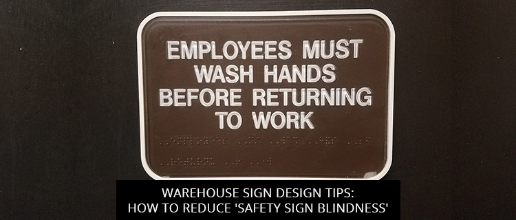
Warehouse Sign Design Tips: How To Reduce ‘Safety Sign Blindness’

Warehouse sign “blindness” can lead to serious injury in the workplace, but it can be prevented! Today’s post highlights three warehouse sign design tips to make your safety signage more effective, courtesy of our warehouse sign specialists here in St. Louis.
Read on or call (314)-726-5500 to start a free consultation.
What Is Warehouse Sign “Blindness”?
Warehouse sign blindness, more commonly referred to as safety sign blindness, comes in two forms: cluster sign blindness and familiarity sign blindness.
As the name suggests, cluster sign blindness occurs when warehouse signs are installed too close together, in clusters. Just as “the retail environment can overwhelm consumers with visual cues,” too many warehouse signs can overwhelm workers with too much to look at, making their messages more likely to go unread (Knuth et al., 2020, p. 7).
But even when audiences are not left totally blind to their messages, warehouse sign clusters take much longer to read, since the cognitive load is much greater. This is unacceptable in warehouse environments, where safety signs need to be read and understood at-a-glance to keep the workforce safe.
Familiarity sign blindness occurs when workers get so used to seeing the same warehouse signs, day-in and day-out, that they stop reading them altogether. This makes it more likely that they will ignore any new safety protocols detailed through warehouse sign updates.
Both forms of warehouse sign “blindness” are dangerous, but both can be avoided with proper sign design and installation practices. What follows is a review of some warehouse sign design tips to help you reduce the risks of safety sign blindness.
Top 3 Warehouse Sign Design Tips To Avoid “Safety Sign Blindness”
- Design signs to work together, without clustering together. The process of creating a complete sign system is quite different from standalone sign design. When designing a warehouse sign system, each sign should be limited to a single message or directive, rather than detailing your entire safety protocol in one shot.
The best warehouse sign systems coordinate these distinct sign messages so that each sign plays off another, allowing warehouse managers to create a kind of “breadcrumb” delivery system, where relevant information is delivered in small “servings” as needed. This allows you to avoid sign clusters, and lessen the cognitive load involved in reading your warehouse sign, without omitting any relevant safety information.
For more help creating cohesive warehouse sign systems, contact our team.
- Regularly update warehouse signs. The best way to combat familiarity sign blindness is to regularly shake up your sign system. Whether you need changeable warehouse sign boards, or your fonts and graphics could use an overhaul, we can help.
- Strive for color coordination, not color camouflage. While many business owners like to keep their warehouse sign colors “on-brand,” you should be careful about making them look too much alike. It can be useful to group related signs with like colors, but too much color coordination across the entire warehouse sign system can actually camouflage critical safety instructions. Our team can help you strike the perfect balance.
Free Quote On Warehouse Sign Design And Production In St. Louis
Call (314)-726-5500 or visit the Horizon Sign Company website to book a free consultation and receive a quote on any warehouse sign order. We’re a locally owned company that proudly serves Brentwood, Richmond Heights, Webster Groves, Rock Hill, Clayton, Maplewood, Kirkwood, and surrounding areas throughout St. Louis county and city.
References
Knuth, M., Behe, B. K., & Huddleston, P. T. (2020). Simple or complex? Consumer response to display signs. Interdisciplinary Journal of Signage and Wayfinding, 4(2), 7-22.
Back
