
Optimize Outdoor Sign Performance: 4 Tips To Avoid Costly Wayfinding Errors
Today’s post shares 4 tips to help businesses optimize outdoor sign performance and minimize the risks of costly wayfinding errors. Read on or call (314) 726-5500 to speak directly with an outdoor sign designer near you.
Outdoor Sign Design: 4 Tips To Avoid Costly Wayfinding Errors
According to the BrandSpark / Better Homes and Gardens American Shopper Study, nearly two-thirds (60.8%) of US consumers have “driven by and failed to find a business they intended to visit” because the signs were too small, unclear, or improperly placed.
To help you avoid these costly wayfinding errors, our outdoor sign specialists recommend:
- Incorporating movement into your outdoor sign display. The human eye is attracted to movement, so it’s a good idea to put your sign in motion where possible. Some local sign codes prohibit signage with moving parts, and illuminated signs cannot flash, blink, or strobe in St. Louis, but there are still plenty of ways to work around these restrictions.
For example, you might consider bolstering your outdoor sign system with a flag or two. These not only add color, verticality, and a sense of ceremony or authority, but also create eye-catching movement as they flutter in the breeze.
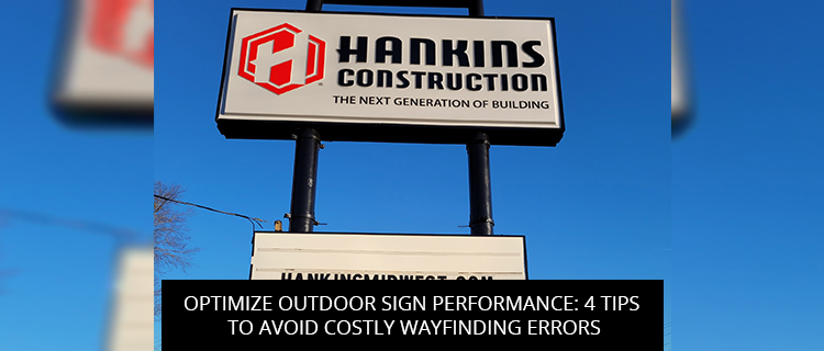
- Optimize your outdoor sign orientation. In a seminal study by the Journal of Transportation Engineering, researchers Zineddin et al. (2005) determined that perpendicular signs (i.e. outdoor signs set up perpendicular to the sidewalk or roadway, so that they face incoming traffic) are much easier to spot than parallel signs, even when parallel signs are built two-to-three times larger. Thus, if you want to minimize your risk of wayfinding errors, opt for a perpendicular orientation.
- Go big with your outdoor sign. When it comes to wayfinding, size definitely matters, especially if you’re trying to safely engage in-car audiences. The International Sign Association recommends making letters at least 1” tall for every 25’ of viewing distance, but as long as you don’t crowd the sign face, bigger is almost always better.
- Crank up the contrast for better wayfinding outcomes. Contrast is king for sign conspicuity and legibility. During the design phase, look for opportunities to crank up internal contrast, placing bright lettering on dark backgrounds or vice versa. During the installation phase, try to create external contrast, positioning your sign somewhere where it stands out from its surroundings due to its incongruous shape and color.
Improve Outdoor Sign Performance: Book A Free Consultation In St. Louis, MO
To start a free consultation with our outdoor sign specialists, you can:
- Call (314) 726-5500
- Email contact@horizonsignco.com
- Use our online contact form
References
Zineddin, A. Z., Garvey, P. M., & Pietrucha, M. T. (2005). Impact of sign orientation on on-premise commercial signs. Journal of Transportation Engineering, 131(1), 11-17.
Back