
Commercial Sign Review: Design Lessons Learned From St. Louis Success Stories

Commercial signs are broadly defined as any sign, display, or device intended to encourage or promote the purchase of commercial goods and services.
This encompasses a wide range of different advertising tools, from monument signs and banners to illuminated channel letters and digital displays, but they all use the same basic design principles to catch eyes, impress audiences, and convert prospects into customers.
To help you create high-performance commercial signs, today’s post highlights a few of these design principles in action in St. Louis, MO.
Read on to reverse-engineer some successful commercial sign designs, or call (314)-726-5500 to speak directly with a commercial sign specialist near you.
Commercial Sign Review: Design Lessons Learned From St. Louis Success Stories
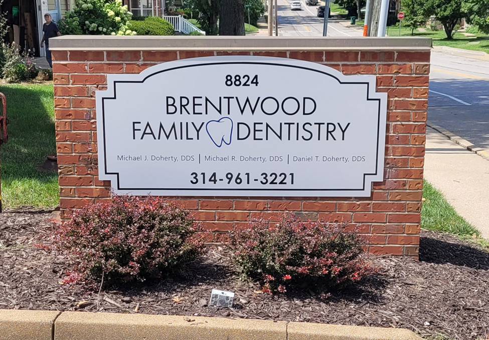
This custom monument sign we recently completed for Brentwood Family Dentistry puts several design best practices to work, leveraging the advertising power of:
- High contrast between sign font and substrate—According to James Bullough, a researcher at the Interdisciplinary Journal of Signage and Wayfinding, “the contrast between a sign and its immediate background is the primary determinant of one’s ability to detect the sign… perhaps more than size” (Bullough, 2017). In this case, we used black-on-white, one of the most high-contrast combinations available, to create strong internal contrast. To crank the conspicuity up even more, we mounted the white sign substrate onto a ruddy-red brick platform.
- Multimodal design—When words enter long-term memory they do so with a single code. By combining images and text, you dual-code your marketing message, which makes it more engaging and easier to recall. This is known as multimodal design, since we combine two different modes of visual communication: text and images.
In this case, we used the shape of a tooth to create a multimodal design that also conveyed their specialty without words.
- Borders—Borders work wonders in commercial sign designs, acting like a crosshair or reticle to help readers lock onto your marketing message and distinguish it from busy backgrounds. Here, we used a simple black background to do just that.

Here we see a different sign type for a different business, but all the same design principles are on display, including:
- High contrast, with black-on-white and red-on-white to crank up the conspicuity
- Multimodal design, combining text and images for better engagement and recall
- Borders around the sign to draw the eye and help the message stand out from the background
Of course, this is not an exhaustive list; these are just a few of many design principles we use to maximize commercial sign performance. If you want to learn more and put commercial sign design theory to practice for your advertising system, our team is here to help!
Get A Free Quote On Commercial Sign Design In St. Louis, MO
To consult with our design team and get a free quote on any custom commercial sign order, you can:
- Call (314)-726-5500
- Email contact@horizonsignco.com
- Fill out our online contact form
References
Bullough, J. (2017). Factors affecting sign visibility, conspicuity, and legibility: Review and annotated bibliography. Interdisciplinary Journal of Signage and Wayfinding, 1(2), 2-25.
Dewan, P. (2015). Words versus pictures: Leveraging the research on visual communication. Partnership: Journal of Library and Information Practice and Research, 10(1).
Back