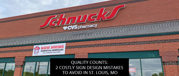
Quality Counts: 2 Costly Sign Design Mistakes To Avoid In St. Louis, MO

Small errors in sign design add up to big losses in marketing returns. Today’s post highlights two ways our team helps business owners steer clear of costly design mistakes in St. Louis, MO.
Read on or call 314-726-5500 to start a sign design consultation and receive a quote on any custom order.
Sign Design Mistake #1: Making Outdoor Signs Too Small
In a seminal study by the Sign Research Foundation, in which more than 100,000 American consumers answered questions about their shopping habits, 49.7% of participants reported “driving by and failing to find a business because its signage was too small or unclear.”
Small signs have their place, but it is not outside, advertising to passing drivers and pedestrians. To catch eyes and make quality impressions, outdoor business signs need to be properly sized. And with our large selection of outdoor business signs and materials at all different price points, you can go big with almost any budget.
To determine the proper size for sign design, you will need to consider several different factors, including:
- Traffic type – Pedestrians have more time to spot small signs, whereas drivers will only be able to read big signs that stand out at-a-glance.
- Sign type and display function – Store hours signs can be quite small, whereas your flagship storefront signage should be quite large. That’s because the store hours sign is informational, intended to be read up close by prospects already engaged with your business. The storefront sign, on the other hand, is for general branding and business identification, meant to make impressions and catch eyes with more of a dragnet
- Display context – Is this sign design intended for a quiet corner on your plot, free from clutter and competition, where the eye is naturally drawn to your display? Or will it be used at a popular off-premise advertising spot, packed with other business signs? Generally speaking, the higher the level of competition, the larger your sign should be.
- Louis County sign code – Section 1003.168 of the St. Louis County Code of Ordinances details size requirements and restrictions for different sign types.
For help determining the right dimensions for your sign design, get in touch with our team in St. Louis, MO.
Sign Design Mistake #2: Creating Insufficient Contrast
Another major reason why 49.7% of American consumers experience sign communication failures is due to insufficient contrast.
In their 1992 book Wayfinding, Arthur & Passini calculated the light reflectancy reading and brightness differential of various colors to determine which color combinations could assure legibility. Some of the top combinations included:
- Black font on yellow background
- Black font on white background
- White font on red background
- Yellow font on blue background
- Yellow font on black background
- White front on blue background
- Orange font on white background
- Blue font on beige background
- Black font on orange background
While these combinations will certainly get you started, you should also consider the display context when planning your sign design. For example, you would not want to use red font in an area dominated by warm brick facades, nor would you want to mount a green monument sign on a lush lawn.
Book A Free Sign Design Consultation In St. Louis, MO
For the best results and biggest returns on your custom sign design, partner with trusted sign design professionals in St. Louis, MO. Call 314-726-5500 or request a consultation online to get started straight away.
Back
