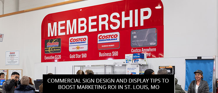
Commercial Sign Design And Display Tips To Boost Marketing Roi In St. Louis, MO

Today’s post reviews commercial sign studies to highlight three best practices for better on-premise marketing displays. Read on to learn 3 design and display tips to get more eyes on your marketing message, or call (314) 726-5500 to speak directly with a commercial sign designer near you.
Commercial Sign Research Review: 3 Ways To Boost Marketing ROI
It goes without saying that commercial signs need effective marketing messages. Alongside the brand name, storefront commercial signs typically include impressive logos and catchy slogans, but little else. In contrast, in-store commercial signs may have some branding elements, such as company colors or the name of the business, but the majority of the sign face will be dedicated to other information that helps convert in-store prospects to buyers, such as product details and promotional offers.
If you have yet to finalize your marketing message, start there. Our commercial sign designers can help.
But effective marketing messages are only half the battle. To maximize your marketing ROI, your commercial signs will also need to follow certain design best practices, established over decades of marketing research. Read on to learn a few simple ways to tweak your design and display for greater marketing ROI, or call (314) 726-5500 to speak directly with a commercial sign specialist in St. Louis, MO.
- Reduce “visual noise” around your commercial sign display. In one study for the Transportation Research Record, researchers Akagi et al. determined that “the average detection distances for signs decreased from 110 ft with minimal visual noise to 60 ft with high levels of visual noise.” Put simply, the greater the amount of visual clutter surrounding your commercial sign, the less likely it will be spotted by your target audiences. Thus, without changing a thing about your design, you could greatly improve its marketing impact, nearly doubling detection distances, by simply clearing space around the display. Move eye-catching artwork, decorative elements, and competing signage somewhere else.
- Optimize commercial sign display angle. Signs are easier to spot and read when they are perpendicular and centered to the reader (Garvey, 2006). For every inch or degree your sign moves away from this optimal viewing angle, your marketing ROI decreases. If you need help finding the best place for your commercial sign display, get in touch with our installation experts.
- Opt for internal illumination where possible. In one study published by the Handbook of Transportation Engineering, Garvey & Kuhn (2011) found that internally-illuminated signs and neon signs performed 40-60% better in legibility tests compared to externally-illuminated signs, presumably because internal illumination makes individual letters more legible, whereas some external lighting rigs may “wash out” the messaging.
If you want to explore some internally-illuminated commercial sign options, get in touch with a member of our team
Free Quote On Commercial Sign Design In St. Louis, MO
To start a free consultation with a commercial sign specialist in St. Louis, MO, you can:
- Call (314) 726-5500
- Request a consultation by filling out the short form on our website
- Email contact@horizonsignco.com
- Stop by our commercial sign shop at 748 Hanley Industrial Court, St. Louis, MO 63144
References
Akagi, Y., Seo, T., & Motoda, Y. (1996). Influence of visual environments on visibility of traffic signs. Transportation Research Record, 1553(1), 53-58.
Garvey, P.M., (2006). On-Premise Signs, Determination of Parallel Sign Legibility and Letter Heights. University Park, PA: The Visual Communication Research Institute.
Garvey, P. M., & Kuhn, B. T. (2004). Highway sign visibility. Handbook of transportation engineering, 11-1.
Back
