
Address Number Sign Design: 6 Tips For Better Legibility And Wayfinding

Though they do not actively promote products and drive sales, address number signs are one of the most important parts of any business sign system.
Not only do they facilitate wayfinding for motivated buyers and new clients; they also ensure your business can be located by delivery personnel, new hires, and emergency services in times of need.
But in order to do their duty, address number signs must be legible. And that’s what today’s post is all about.
Read on to review the research and learn 6 tips for better address number sign legibility and wayfinding outcomes, or call (314)-726-5500 to begin a free design consultation in St. Louis, MO.
Address Number Sign Design: 6 Tips For Better Legibility
1. Choose High-Performance Address Number Sign Fonts
Traffic sign studies offer plenty of useful insights about font legibility we can use to inform our design strategy.
For instance, one study by Garvey et al. (2001) ranked Bank Gothic Light and Dutch Regular as the top performers in driver legibility tests. Perhaps unsurprisingly, both of these fonts are simple, straightforward, sans serif options, not unlike the highly readable, “standard word document” style used in this very blog post. In contrast, fancy cursive “serif-style” fonts, such as Commercial Script Regular, are much harder to read, especially by passing drivers with limited viewing windows.
That said, you can use fancy fonts without any appreciable loss in legibility range, but you’ll have to increase the size of your sign (and your sign budget) to do so. Garvey et al. (2001) found that, in order to be read at the same distance, a sign using Commercial Script Regular would need to be four times the size of one using Bank Gothic Light.
So what’s the bottom line? If you’re working with a small budget or display area, stick to simple and readable fonts; if your vision demands something fancier, prepare to upsize your sign order, or at least incorporate some more of our legibility tips to make up the difference.
2. Choose The Right Letter Case For Address Number Signs
All numbers are written in uppercase, but what’s best for the rest of your address?
As a general rule, mixed-case address number signs (i.e. those with standard capitalization) perform best in legibility tests, with all-uppercase or “majuscule” signs coming in at a close second.
For most applications, miniscule or lowercase addresses aren’t recommended. However, they do create a sense of whimsy and playfulness that might suit a daycare, toy store, or similar business. To discuss your needs and how to mitigate the legibility risks of miniscule lettering, get in touch with our team.
3. Minimize Visual Noise Around Your Address Number Sign
One study by the Transportation Research Record found that the average address number sign detection distance decreased from 110 feet to 60 feet when there were “high levels of visual noise” from competing signage.
Obviously, we cannot ask our neighbors to take down their signs to help ours stand out, but we can separate our signs from the pack with smart placement.
For best results, we recommend mounting address number signs away from any “sign clusters” you may have in place. Placing your address number signs in close proximity to your main business sign is not a problem, but burying it within a cluster of posters, flyers, informational graphics, and COVID-19 safety signs is a mistake.
If possible, it’s also a good idea to mount your address number signs up high, as this elevates them above most standard on-premise displays, and prevents any unwanted obstruction from traffic, parked cars, and inclement weather.
4. Add Some Dimension To Your Address Number Signs
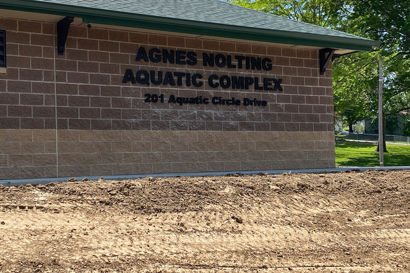
Dimensional address number signs, as pictured above, can greatly improve legibility range. This is partly due to the eye-catching effect of dimensional lettering, which seems to leap off the substrate and out at the viewer, but it is also a result of the natural outlining effect that occurs when shadows form in the kerning.
5. Go Big With Address Number Signs
Researchers at the International Sign Association recommend designing address number signs with characters a minimum of one-inch tall for every twenty-five feet of viewing distance. Accordingly, you should consider your sign setback, as well as your audience’s typically “reading range,” when settling on your letter size specifications.
6. Ensure Adequate Lighting For Address Number Signs
Traffic sign researchers have determined optimal sign luminances for nighttime legibility around 35 cd/m², but if your business is based in a brightly lit district, or your sign is frequently blasted by blinding headlights from passing cars, sign luminances between 70 and 340 cd/m² are recommended.
Additionally, when given the option, opt for internal illumination over external lighting, as internally-lit signs have been shown to be readable from 40-60% further away in legibility tests (Bullough, 2017).
Simplify Your Address Number Sign Design: Book A Free Consult
Looking for more best practices for address number sign design? Look no further.
To speak directly with our address number sign designers and get a free quote on any order, you can:
- Call (314)-726-5500
- Email contact@horizonsignco.com
- Fill out our online contact form
References
Akagi Y, Seo T, Motoda Y. 1996. Influence of visual environments on visibility of traffic signs. Transportation Research Record, 1553: 53-58.
Bullough, J. (2017). Factors affecting sign visibility, conspicuity, and legibility: Review and annotated bibliography. Interdisciplinary Journal of Signage and Wayfinding, 1(2), 2-25.
Garvey, P. M., Zineddin, A. Z., & Pietrucha, M. T. (2001, October). Letter legibility for signs and other large format applications. In Proceedings of the Human Factors and Ergonomics Society Annual Meeting (Vol. 45, No. 18, pp. 1443-1447). Sage CA: Los Angeles, CA: SAGE Publications.
Back