Beginner’s Guide To Channel Letter Design: Fonts And Letter Casing
When it comes to choosing channel letter casing and font, is beauty in the eye of the beholder, or do design best practices exist?
Today’s post reviews some marketing research on the effectiveness of different sign fonts, then explains how the unique properties of channel letters gives you more freedom than the average sign type.
Read on to learn more, or call (314)-726-5500 to speak directly with a channel letter sign specialist in St. Louis, MO.
Research Review: Channel Letter Font And Casing Considerations
For starters, what does the research say about the effectiveness of different sign fonts?
In a 2017 report for the Interdisciplinary Journal of Signage and Wayfinding, John Bullough ranked all of the different factors affecting sign visibility, conspicuity and legibility, and font selection took the number-one spot, being more impactful than color choice, sign environment, and letter size.
So clearly sign fonts are an important part of any sign design, but which ones work best?
Reviewing decades of literature on the subject, Bullough (2017) found:
- Serif fonts work best, outperforming sans-serif fonts in measures of visual acuity
- Solid fonts are easier to read, with “outline fonts” needing to be 1.8 times as large to achieve equivalent legibility
- The following fonts were the easiest to read: Gill Sans Uppercase, Avenir Medium Uppercase, Copperplate Gothic Uppercase, Helvetica Uppercase, and Kabel Ultra Uppercase
- The following fonts were the hardest to read: Old English Uppercase, Mistral Uppercase, Old English Lowercase, Brush Script Lowercase, and Mistral Lowercase.
Bullough (2017) also found that letter casing had a measurable impact on sign effectiveness, with mixed-case capitalization (i.e. In This Style, following the capitalization rules used in standard titles) being easier to read than all-uppercase (i.e. capital letters or majuscule letters) or all-lowercase (formally known as minuscule letters).
However, while these studies offer some valuable data, it is important to acknowledge their limitations for channel letter sign design. Specifically, these studies looked at the effectiveness of different fonts and letter casing on the readability of small, two-dimensional, unlit sign types, not large, illuminated, 3D channel letters.
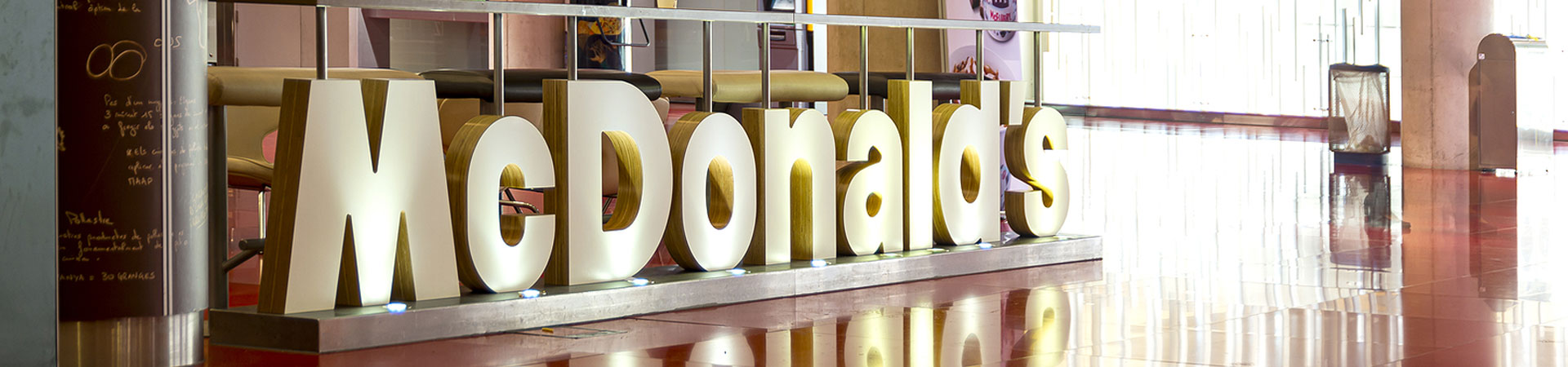
In other words, while it’s not a bad idea to play it safe using mixed-case capitalization and one of the top-performing fonts listed above, you should not feel limited to these options in your channel letter design. The unique features and physical properties of channel letters—sign, lighting, logos, dimensional design, and prominent positioning—easily make up for any disparities in font performance, giving you many more design opportunities, and our team can help you explore them all.
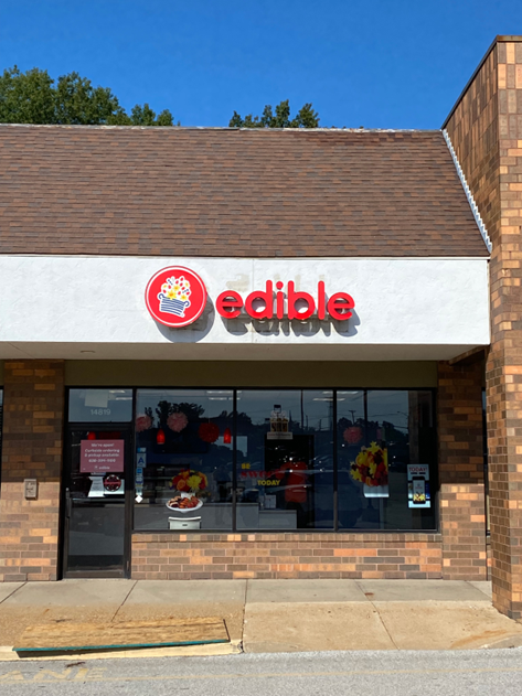
For example, this sign for edible breaks the standard printed sign rules, using all lowercase capitalization and a sans-serif font. But with its sharp red-on-white color contrast, illumination, and a logo that looks good enough to eat, this company has no problem catching eyes.
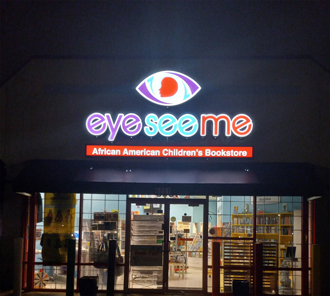
The same can be said for eye see me, an African American children’s bookstore making a big impact in our community:
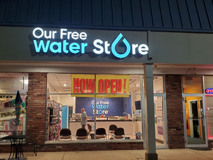
With channel letters, the creativity possibilities really open up, and many standard sign design rules no longer apply. For this project, we used evocative symbols in place of letters, replacing the letter O with an illuminated drop of water :
In conclusion, while existing research on effective sign fonts can provide a useful basis for your design, you should not feel constrained to those options. The unique physical properties and design features of channel letters make them highly conspicuous, so you can bend or even break the rules prescribed to printed media and get creative with your font and letter casing.
Get Started On Your Channel Letter Design: Go Pro In St. Louis, MO
Whenever you’re ready to put your brand name up in lights, Horizon Sign Company is here to help. Our team has helped design, build, and install corporate-quality signage for businesses big and small, all across St. Louis and the surrounding communities, and we can do the same for you.
To discuss your design, find the perfect font and channel letter casing for your brand, and get a free quote on any order, you can:
- Call (314)-726-5500
- Email contact@horizonsignco.com
- Fill out our online contact form
References
Bullough, J. (2017). Factors affecting sign visibility, conspicuity, and legibility: Review and annotated bibliography. Interdisciplinary Journal of Signage and Wayfinding, 1(2), 2-25.
Back